8 Ways To Incorporate Pantone’s 2018 Colour Trend Predictions
Colour trends are always changing… Greenery is the top Pantone colour trend of this year and we can’t wait to know the 2018 colour trend! Well, you don’t need to wait for that much, because we’re bringing you a glimpse into the near future. We’re more than halfway through 2017 already, which means it’s time to discuss which colour trend will define next year.
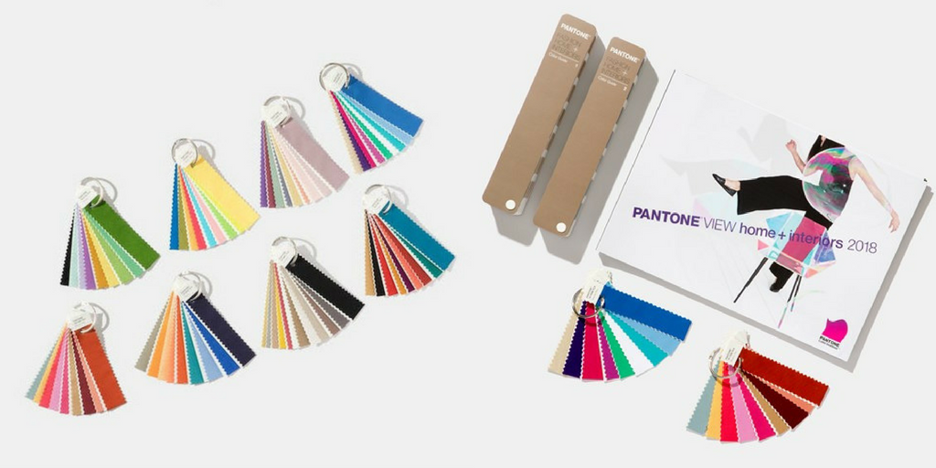
Leatrice (Lee) Eiseman – executive director of the Pantone Colour Institute gave attendees a peek into what’s on trend for 2018 at the International Home + Housewares Show. And there seems to be something for just about everyone. 8 colour trends were announced: Verdure, Resourceful, Playful, Discretion, Far-fetched, Intricacy, Intensity and TECH-nique.
Instead of simply explaining them to you, we want to show how you can incorporate them into your home. We’ll help you get ahead of the trend and give your house the perfect colour scheme for 2018.
2017 Colour Trend: Greenery
Despite the fact that we’re just a part of the way through 2017, regardless, we’re wrapping our heads around how to use Greenery (the 2017 Pantone Colour Trend of the Year) in each and every way imaginable, and right now, we have more motivation to consider for the year ahead.
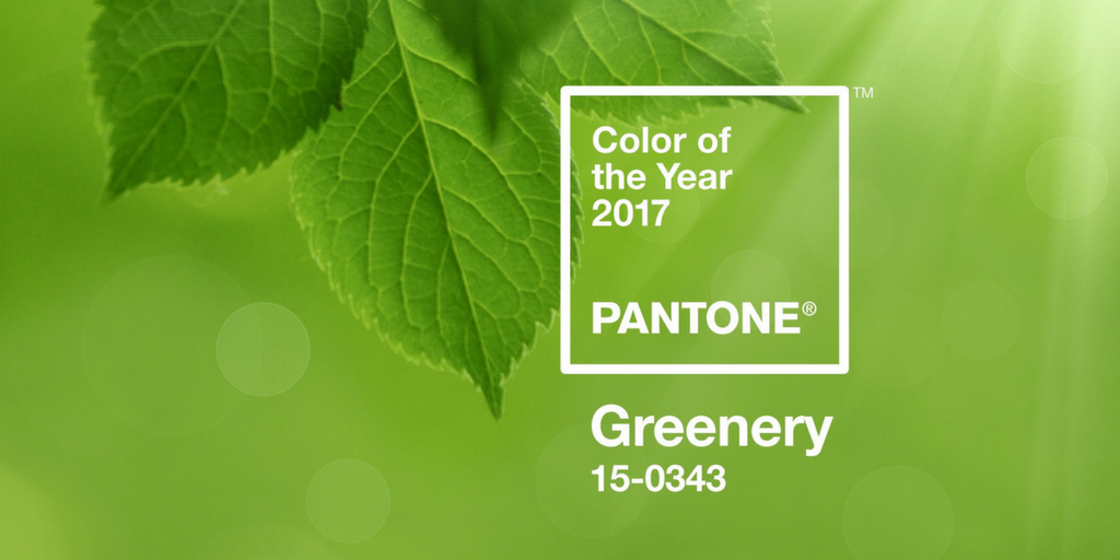
Greenery is said to be symbolic of “new beginnings” and is described as a “fresh and zesty yellow-green shade that evokes the first days of spring when nature’s greens revive, restore and renew.”
It is also described as “illustrative of flourishing foliage and the lushness of the great outdoors.” In addition to that, Greenery is a versatile “trans-seasonal” shade that lends itself to many colour combinations.
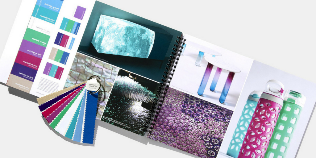
2018 Colour Trend Predictions
Pantone Color Institute Executive Director Leatrice Eiseman shared the predictions and predicts that our infatuation with iridescence will continue, since ‘the human eye can absolutely not avoid’ anything pearlised or translucent. “Metallics we know are classic, but they have really moved over into neutrals,” Eiseman said.
Another standout trend will include bright and bold colours will replace pastel shades, (like 2016’s Colours of the Year Serenity and Rose Quartz, or the omnipresent Millennial Pink) reflecting our increasingly intense lifestyles and thought processes — music to the ears for bright colour lovers.
Ready to start a colour scheme for 2018? The eight colour groupings, you can expect to see next year, are:
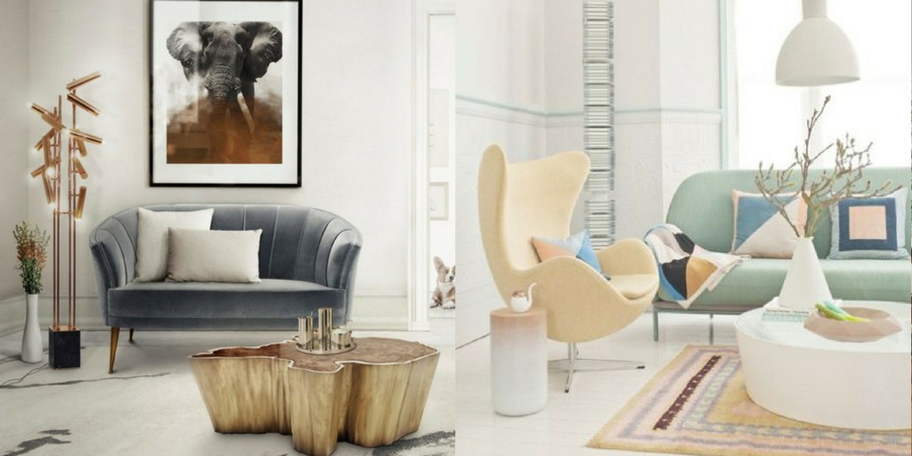
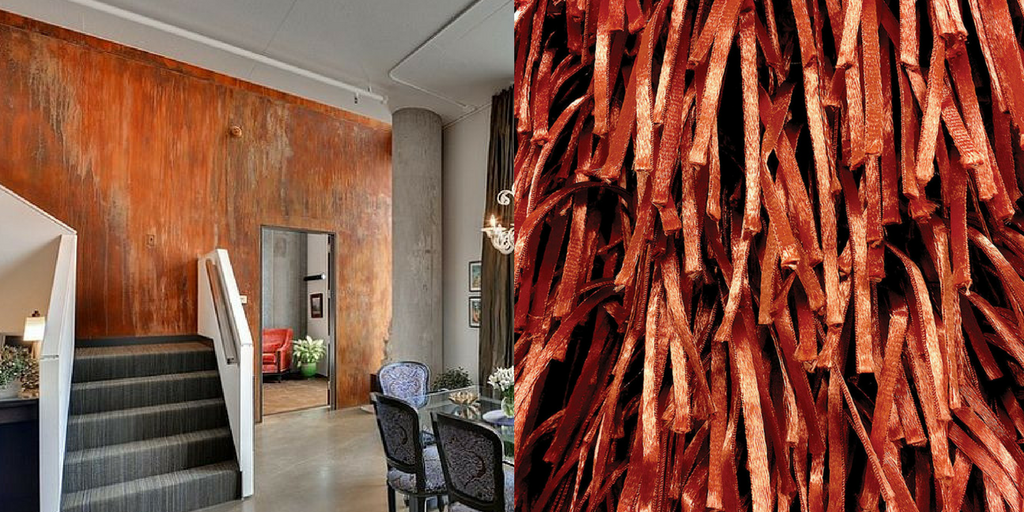
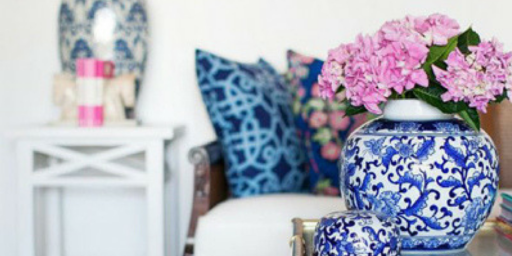
Intensity
Giving a diverse blend of hues, Intensity passes on “a certain strength, power, depth and sophistication,” said Eiseman. Coolly made shades out of plum, blue and blue-green suppress the flames of orange Emberglow, Liquid Magma and Bossa Nova. These can be balanced with golds and dark accents, that finish the palette.
One of the biggest highlights is going to be the use of these hues. These dark shades give any room a very luxurious and delicate image. Whether used on walls, furniture or accessories this colour enlights the best of a division.
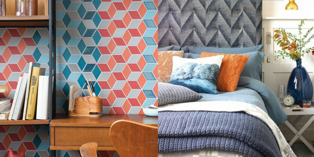
Resourceful
This palette is comprised of two beautiful complementary colours on the spectrum; integral blue and orange hues. “This is quite an interesting colour combination,” said Eiseman. “It combines warm and cool tones that you just can’t avoid looking at it.”
We feel that these blue and orange enhancing chair backs will give your kitchen an unremarkable and classy colour lift that will welcome visitors from the minute they go into the room.
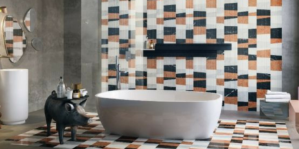
Far-fetched
This palette “reaches out and embraces many different cultures,” said Eiseman. It pleasingly combines three popular blushing tones with Iced Coffee and Ruby Wine, and in additional a couple of warm, earthy hues such as Cornsilk yellow.
We imagine that these tints would be perfectly spoken to with this origami-roused wall background. Think of it as a special scenery for your next gathering! These colours go very well with each other – one can say that it’s a match made in heaven!
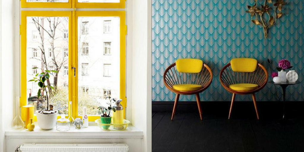
Playful
Think Despicable Me “Minions.” Speaking to our need for whimsy (“People need to stop and smile” said Eiseman), the playful and lively palette is charismatic and quirky. The colours are “bright-hearted more than light-hearted” with names to match, like Minion Yellow, Lime Popsicle, Green Flash and adventurous blue Skydiver.
Add something whimsical to your room by incorporating bright yellow, lime popsicle, and all other things fun come together for this colour scheme. What better approach to show off these awesome hues than on fun and unique pillows that unite brilliantly vibrant tones?
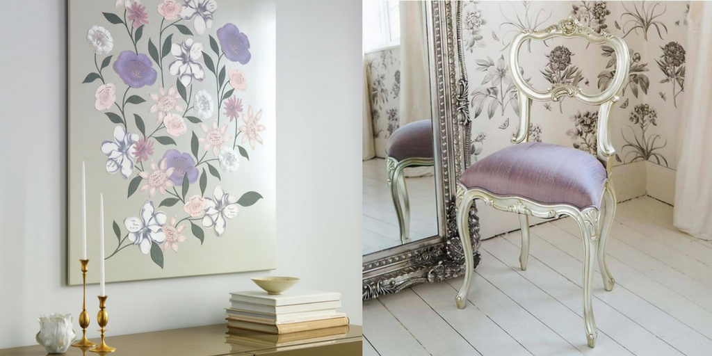
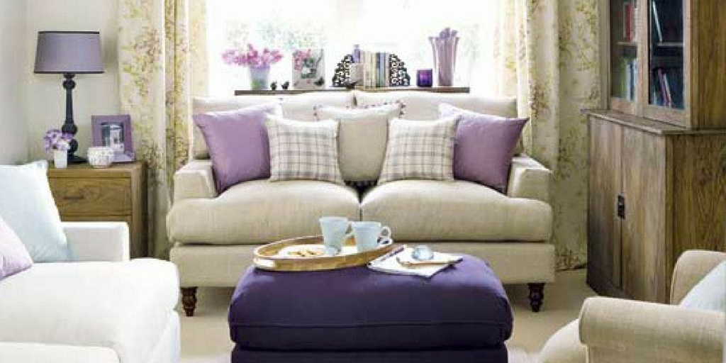
Discretion
Serene and delicate, Discretion is the alter ego and opposite of Playful. Nostalgic shades such as Elderberry, Burnished Lilac and Hawthorne Rose combine with stimulating tones to offer novelty to an inconspicuous palette. “Pink has developed more power than ever before,” said Eiseman.
We think that this shade of lilac is very subtle and has a calming effect. Even for the ones that usually wouldn’t bet in the lilac colour when it comes to home decor, this one will make you change your mind and will make you at peace with your inner self. This shade accentuates a space’s natural light.
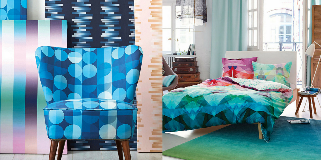
TECH-nique
In a gesture to the expansion of innovation, this palette is all about highlighting tones “that seem to shine from within.” The palette is a blast of fun and uproarious hues like dynamic blue, green, fuchsia and purple, alongside glowing peacock tones in both turquoise and hot pink, that are counterbalanced by Brilliant White and Frosted Almond. As these could some way or another appear to be overwhelming.
Why not include these hues on a lesser scale all through the house with these heart-confined shadow boxes, which allow pops of colour to radiate through their edges.
Verdure
This palette highlights vegetable-inspired colours like Celery and Foliage being combined with berry-mixed purples and an eggshell blue. “This palette is so symbolic of health,” said Eiseman, however it refreshes the abundance of greens with some splendid and differentiating shades.
Depending on the chosen decoration, it can give a home a heavier or lighter look. It’s a major bet in all spaces, from the kitchen to the bedroom. This colour gives a certain charm and recalls the beachy vibe.
Intricacy
This palette mirrors the notoriety of complex outlines that Eiseman talked about before. It includes the “new neutrals,” otherwise known as metallics, however, a flowery Holly Berry Red and yellow Sulfur emphasise a layer of drama.
All things considered, what is more mind boggling than wallpaper? It’s also a moderate approach to bring patterns into any space. Furthermore, these decorated stairs will bring the Intricacy design palette flawlessly into your home.
Related Interior Design Trends
Eiseman also predicted some of 2018’s design trends.
She anticipates that the 1970s pattern will remain solid, with fringe being “very hot and very strong. She highlighted our fascination with letters and words as a design element, the use of triangles as a motif, and dimensional diamonds and intricacy (which she attributes to the popularity of 3-D printing). Wood treatments have also become “very unique and really artful,” she said.
Maybe that is likewise a purpose behind the growing popularity of design motifs that offer an escape, such as animals, jungles and the comeback of the quirky and unique Memphis Movement from the 1980s.
Thoughts?
Share your thoughts: Which trend are you most excited for in 2018? Or are you happy to see anything that isn’t Greenery?
It’s exhausting to find educated individuals on this topic, however you sound like you already know what you’re speaking about! Thanks