When it comes to adding a bit of freshness to your interiors, it doesn’t have to mean a full redesign of your home. Bringing in accessories, prints and patterns to mix and match can be a great way to breathe some newness without redecorating.
Mixing and matching can be a daunting interior method, but following some simple rules it can be very effective.
How To Mix And Match Prints
Choose A Colour Palette
When it comes to mixing prints, it’s good to have a consistency which can bring a coherence to the opposing patterns.
Opt for a colour palette which can sit in harmony across the multiple prints and accessories you’re looking to bring into the space.
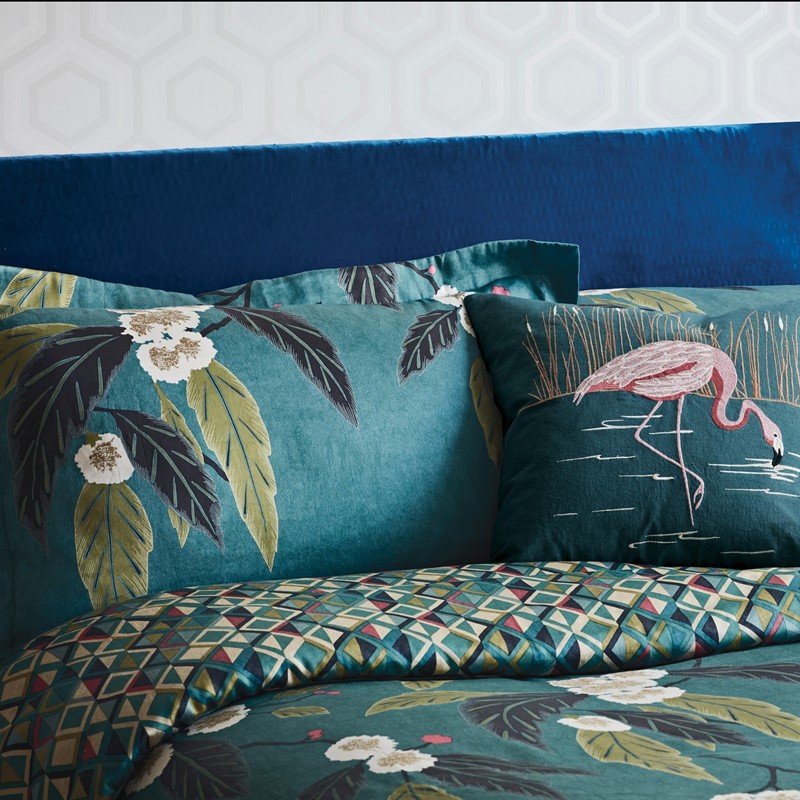
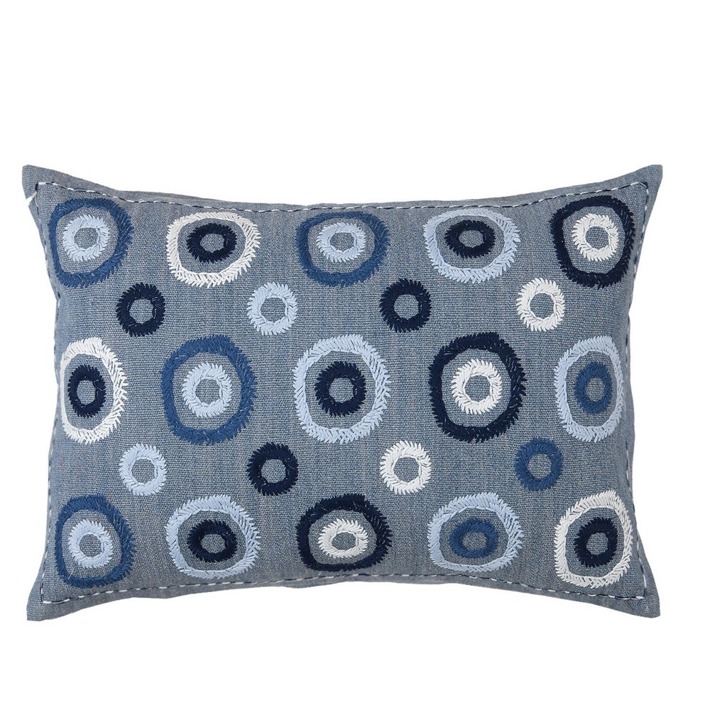
Differing shades and hues of blues and greens can give a unity to a room. This helps to balances out the opposing prints. This makes sure the room doesn’t look too busy or cluttered, and has a sense of harmony. This allows the prints to sing, without the room becoming overwhelmed.
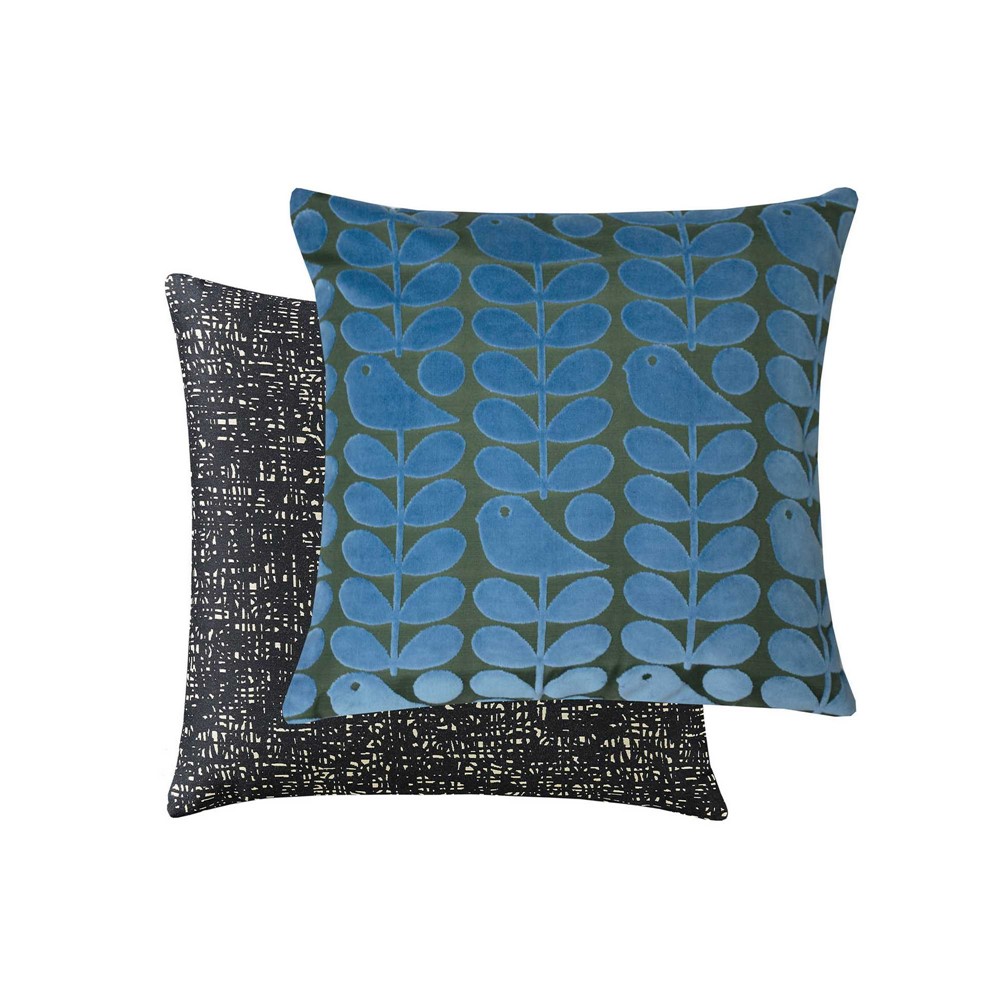
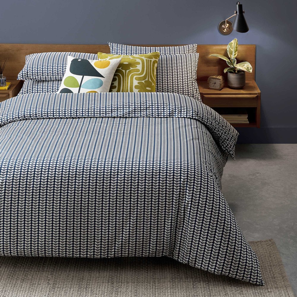
Try pairing a blue bold print with another, like this Coppice tropical print bedding with this Orla Keily velvet early bird cushion.
You can use the colour you’ve opted for as an alternative for a neutral. Bringing an item such as an armchair into the room in a plain blue shade can give you a blank canvas to work with, without straying from the theme.
You can even bring in a contrasting accent colour in a plain shade. Using bright pops of pink in a blue printed room can be very effective. Just be aware to stick to plain accessories, as more print in an opposing shade can be overwhelming.
Opt For White Based Prints
If the combination of brightly coloured and busy prints is too much for you, white based prints can be a more subtle way to work the trend. Prints that have a white base can be easier to weave into interiors without being overwhelming.
Busy prints can sometimes close a space up, so if you have a smaller space to work with, this could be more complementary.
Florals and stripes are common prints that have a white base and work for this style. Work a striped sofa with opposing striped cushions, like this William Yeoward Nikita Cushion.
The white base of the print works to pull the interior together in harmony, over the colour combinations.
Use Neutrals As A Base
If you want to make a statement with bold and bright prints, it’s best to pair them with neutral shades. This can work as a base and make sure the space isn’t overwhelmed.
Build around a neutral colour palette. This helps when including patterns to mix the bolder shapes and shades pf your interior. Curtains are a great way to do this, as it helps to frame the room.
Using neutrals makes sure the space doesn’t feel closed in, and when the curtains are shut it doesn’t overwhelm the space. Try a style like these Wandle curtains by Morris & Co.
In contrast, Christian Lacroix cushions are pieces that use an array of patterns and colours. Like this Botanic Rainbow cushion.
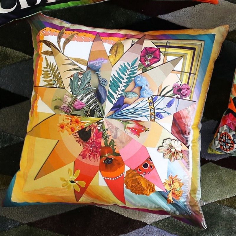
Accessories like this are harder to mix and match with other printed styles. This is due to the variety of colours and unique shapes of the piece. This print would look overwhelming on top of a printed sofa, but would complement a neutral piece of furniture sitting in front of a printed wallpaper.
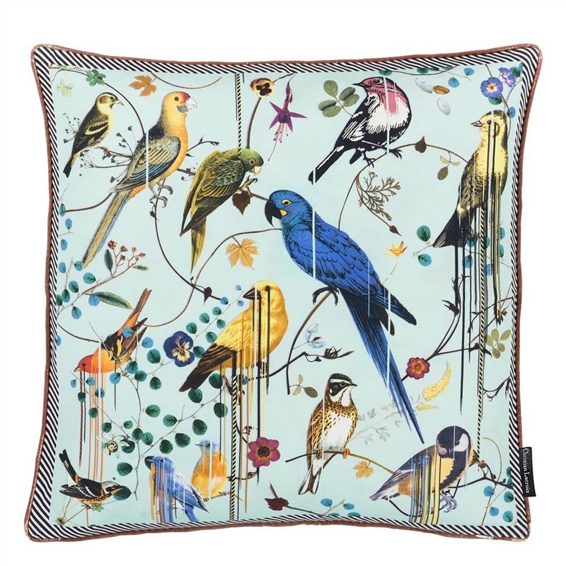
You can also pair up different cushions on a neutral piece of furniture. You can then add patterns that align with each other but aren’t clashing against each other. Like this Christian Lecroix Birds Sinfonia cushion.
Combine Different Scales of Patterns
A way to add cohesiveness between prints when you mix and match is to pair opposing scales of prints. Using wide stripes in a room paired with pinstripe printed accessories can be a chic and subtle way to clash prints.
Orla Keily’s iconic stem print in the tiny stem bedding set can be styled with the bold multi print stem cushions. This not only creates a print clash, but the larger scale version of the pattern helps to lift and bring out the smaller variations.
Make Use Of Accent Patterns
When it comes to colour combinations of patterns and prints, complementary colours are usually advised. However, if you feel like you want to make a statement, bringing in accent patterns can work very effectively.
With accent patterns, it is very much less is more. Prints can bring a lot of noise to a room, and overwhelming it makes it look cramped. Which is why accent patterns should only be brought in small doses like with accessories such as cushions.
Contrasting through accent colours can be done by using another shade to pick out key colours from an existing print. If you have a multi-coloured floral wallpaper with small elements of blue in, then bringing in something like the Zafora Cushion by William Yeoward would work well.
It would work to bring out the elements of the blue and complement the opposing prints.
If you want to truly make a statement, you can opt for a contrasting print colour. You can determine this by looking at a colour wheel, and choosing the colour opposite to your room’s colour theme.
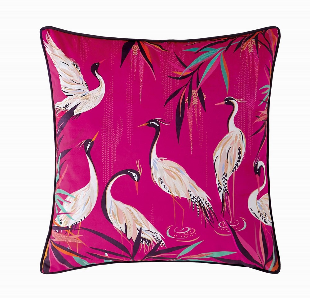
A room dominated by green prints and shades, can be changed up by bringing in a bold pink pattern. It works for a punchy element of mix and match to make a statement. This heron pink cushion by Sara Miller would be a perfect addition to offset the green for a zingy pop of contrasting hues.
Thoughts?
What’re your thoughts on mixing and matching prints? If the thought of it used to scare you, we hope this guide has given you some tips to try out the trend. If you want some more interior inspiration, see how to add a luxury touch to your home through accessories.
Are you ready to make a statement with your interior? Let us know in the comments!
Leave A Comment