The Amazing Ways Room Colour Can Affect Your Mood
When homeowners are determining which room colour they wish to paint their walls, they tend to only focus on the aesthetically pleasing. However, colours have the ability to effect our moods without us even noticing.
Whether you’ve spent hours of time searching for the right shade or easily picked your favourite, the colour of a room has a serious affect on your mood. While room colour can affect people differently (based on their age, gender, ethnic background and climate), research has shown that certain colours tend to get a similar reaction from all types of people.
Before you begin your painting project, think about the mood you want certain rooms in your home to give off. Let’s find out more about room colour and how they influence your mood.
The Psychology of Colour
There’s no denying that colour affects our mood. Those who are sensitive to their surroundings may instantly feel the energy created by a bright red kitchen, as well as the calm evoked by a serene blue bedroom. Others may not notice the colour one way or another, but the effect is still there.
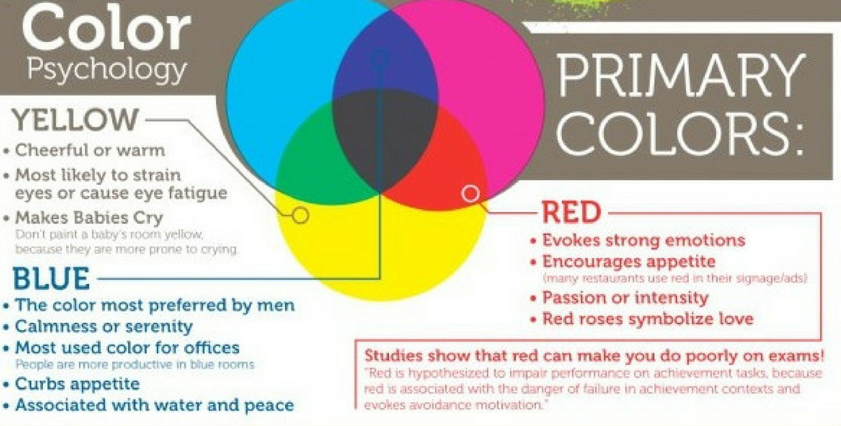
Colour has the power to invigorate, to soothe, to inspire creativity, and even to stimulate the appetite. Start paying attention to the number of red, orange and bright yellow restaurant interiors!
What mood do you want to create? Which colours will help you achieve that mood?
Room Colours and Their Effects
Do you like a neutral colour palette on your walls? Or do you crave colour everywhere? Whichever you opt for, the colours you choose for your walls and décor can have an impact on your mood.
Using colour is an expressive way to convey mood, feeling, personality and emotion. Your colour choice in decor, furniture and accessories contribute to the overall ‘feel’ of your space as well as playing a role in how you feel when you are in that space.
Let’s take a closer look at room colour and learn what it can do to a room.
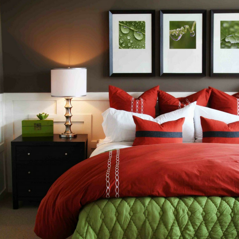
Red Rooms
Red raises a room’s energy level. The most intense room colour, it pumps the adrenaline like no other hue. It is a good choice when you want to stir up excitement, and raise a mood. Red is associated with high energy and power. It is the room colour our eyes are drawn to first in a room, so a little can go a long way. Red signals courage, ambition and strength. It promotes alertness and speed and connects us to our physical self.
As red brings up feelings of excitement, it is great for rooms such as the living room. It will draw people together and can even help to promote and stimulate chatty conversations!
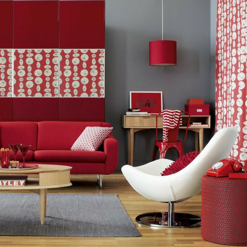
Red may help instill confidence, get us going when we need to be active or task-oriented, and can help as an appetite stimulant – so it is preferred in your dining room. Another great option to incorporate red into your home is to use it in your front entryway, as it will create a strong first impression to your house guests.
Red has the power to raise the heart rate, speed respiration and blood pressure. Therefore, it’s not really the most suitable choice for your bedroom as it’s considered too stimulating. You want a calming room colour in your bedroom, and red is the opposite of that.
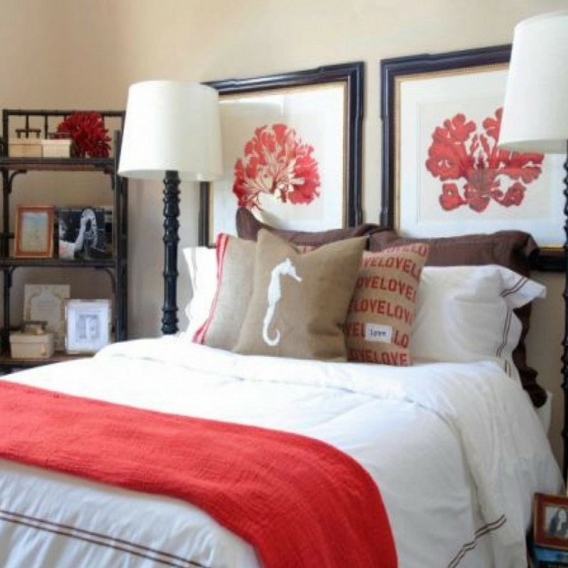
However, as red has many shades, darker hues paired with dimmed lights will make your bedroom seem very rich, elegant and sophisticated and won’t cause the adrenaline rush that it otherwise would.
The colour red is probably most notable for its relation to love, but it is also associated with adventure and an optimistic perspective. Often, red is best suited as an accent colour instead of the primary room colour in decor.
Red: passionate, daring, intimate, comforting, stimulates appetite
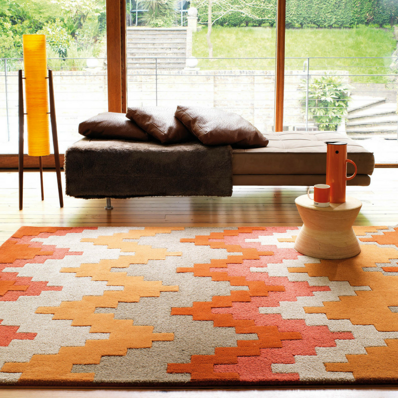
Orange Rooms
Do you have an in-home gym? You can use orange to help you get the most out of your workout. This colour is great for an exercise room, being seen as an energising colour that promotes activity.
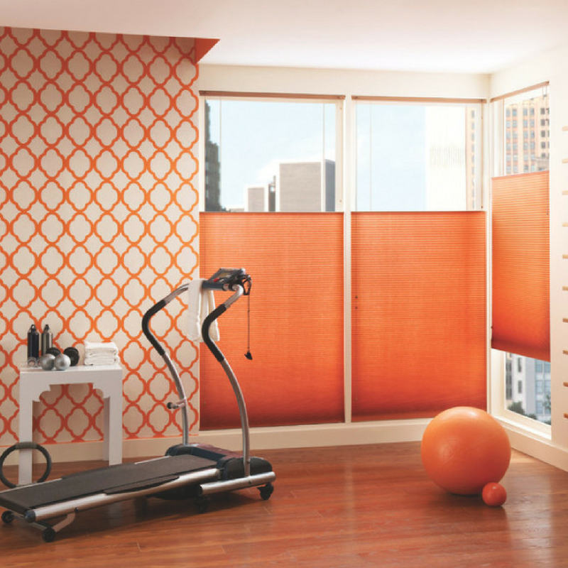
It has the power to evoke feelings of excitement – and can aid your calorie burn making the whole exercising process much more fun! Orange is commonly used in fitness facilities because it encourages motion and energy.
In ancient cultures, orange was believed to heal the lungs and increase energy levels.
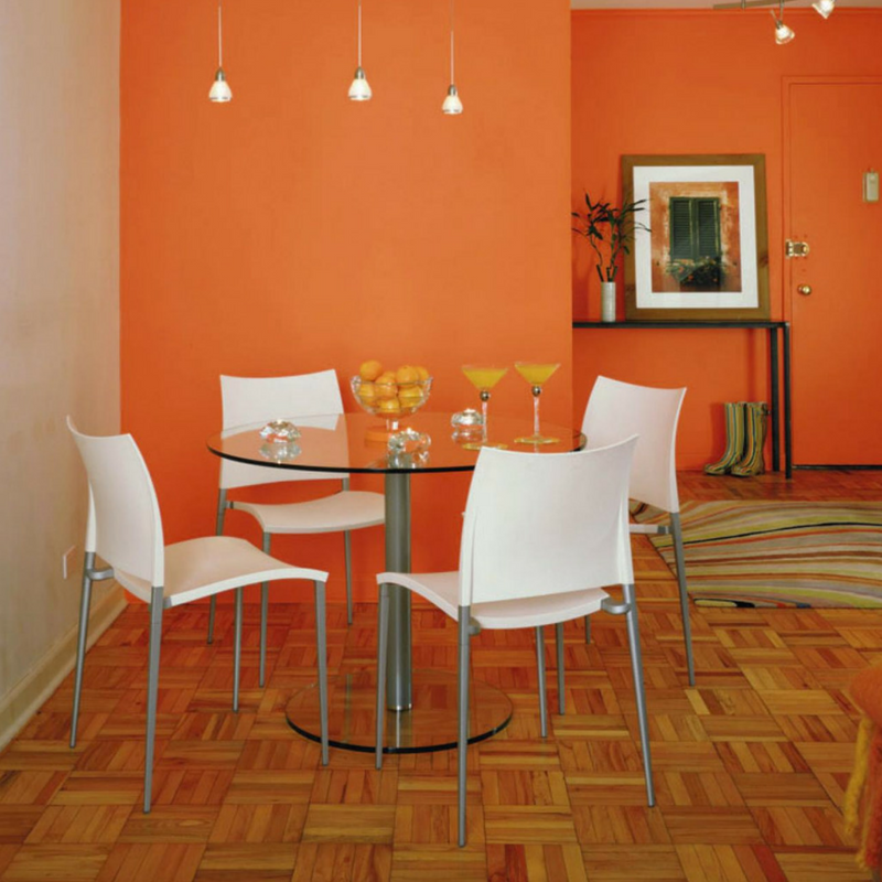
The colour orange conveys feelings of warmth and support. In your home, use orange in your dining room or living room.
However, as orange contains red, a little can go a long way in an interior. Too much orange (or an orange that is too bright or intense) can create overwhelming, irritating or frustrating feelings. In the United States, it is perceived negatively because of its close associations with Halloween and prison.
Orange: stimulates creativity, enthusiasm, evokes warmth and cosiness
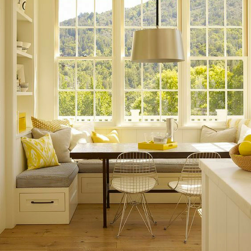
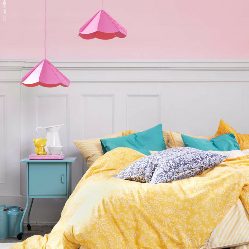
Yellow Rooms
Yellow captures the joy of sunshine and communicates happiness. It is the colour of brightness, cheery attitude and mental clarity. It promotes creative, clear, upbeat thinking and decision making. Yellow can be helpful in easing depression and encouraging laughter. Yellow conveys emotions such as joy, energy and attention and can help you to feel more optimistic and confident.
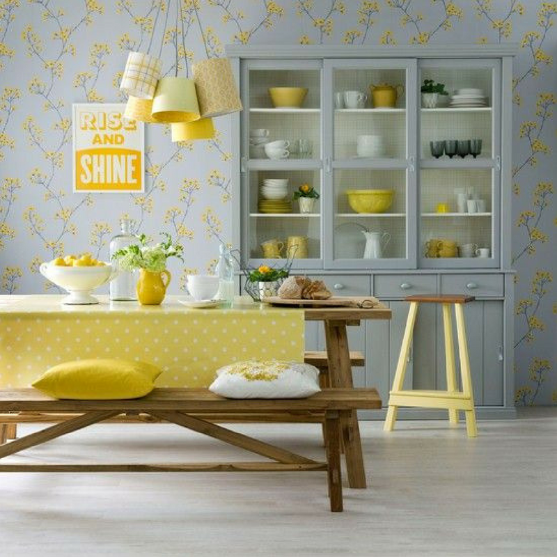
It is an excellent choice for kitchens, dining rooms and bathrooms, where it is bright and uplifting. In halls, entries and small spaces, yellow can feel expansive and welcoming. It’s no surprise that the room colour yellow communicates happiness and a feeling of optimism.
Despite yellow being a cheery colour, it’s not always a good choice for main colour schemes. It can work well as an accent colour, incorporated through accessories and furniture, complementing opposing colours like blue.
Studies have shown that over-exposure to yellow, especially intense and deep yellows, can increase irritability, hyperactivity, and can shorten tempers. In chronotherapy, yellow is believed to stimulate the nerves and purify the body.
Lemon and sunshine yellows are the best hues to go for to ensure happiness and positivity is evoked.
Yellow: welcoming, sunny, and linked to promoting intelligence
Green Rooms
Among all the room colours, green is considered the most restful and soothing colour for the eye. Combining the refreshing quality of blue and the cheerfulness of yellow, green is the perfect choice for almost any room in the house.
It is believed that the colour green evokes feelings of tranquillity and composure because of the abundance of green shades found in nature.
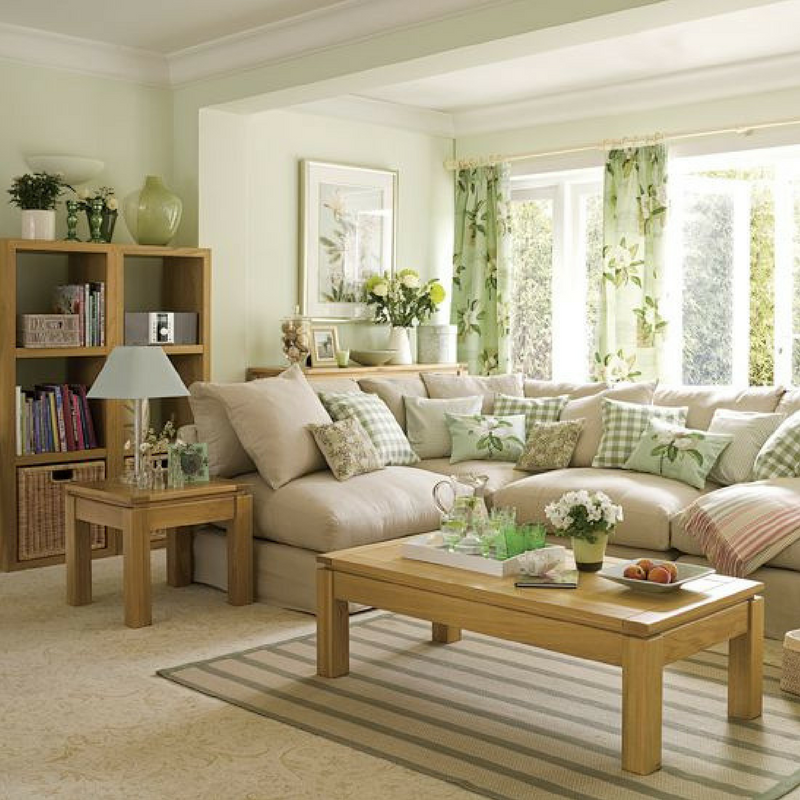
Painting your living room in green will set a friendly and inviting ambience. It also encourages unwinding but has enough warmth to promote comfort and togetherness.
Green is a pleasing room colour. It has many positive qualities — evoking renewal, balance, refreshment and peace — which provides a calming influence and stress reducer. An excellent way to bring green into your home spaces is with indoor houseplants or herb gardens.
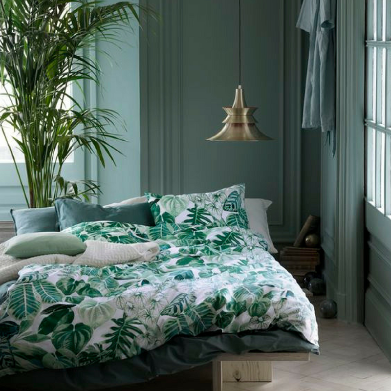
As it is also considered the room colour that has the power to relieve stress, why not paint your bedroom walls in green? Green also has a calming effect when used as the main colour for decorating, believed to relieve stress by helping people relax.
Green works best in bedrooms because of this calming effect, with studies showing that it even prevents nightmares. This room colour represents money, nature and balance.
Green: tranquil, invigorating, fertility, renewal, restful and balancing
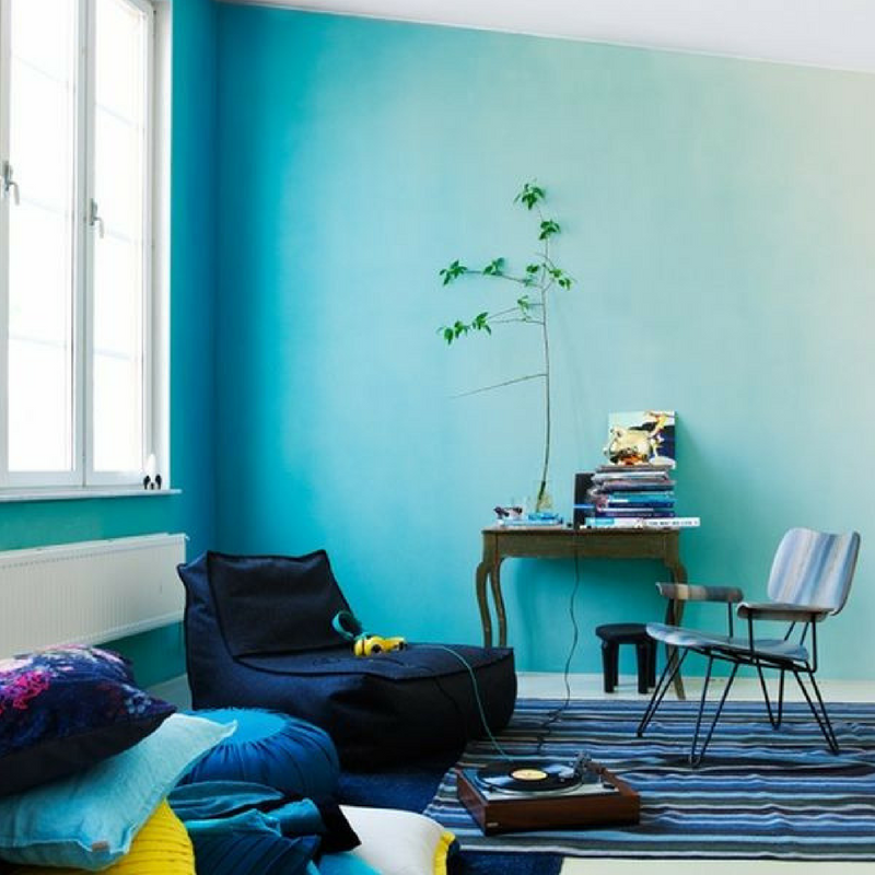
Blue Rooms
Blue is known to have a calming effect when used as the main colour of a room — but go for softer shades. It is said to bring down blood pressure and slow respiration and heart rate. That is why it is considered calming, relaxing and serene, and it is often recommended for bedrooms and bathrooms.
Blue can be very effective to help ward off insomnia and promote a deep, relaxing sleep. It can help balance hyperactivity in children and promotes imagination and intuitive thinking. To encourage relaxation in social areas such as family rooms, living rooms or large kitchens, consider warmer blues, such as periwinkle, or bright blues, such as cerulean or turquoise.
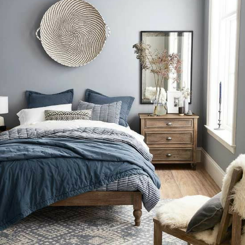
A light blue colour scheme in your home can make you feel more relaxed, calm and serene. While red increases your blood pressure and heart rate, blue does the opposite. That’s why it’s recommended to use light shades of blue in bedrooms and offices. If you opt for a light blue as the primary colour in a room, balance it with warm hues for the furnishings and fabrics.
Also, in contrast to the soothing light blue, dark blue has the opposite effect evoking feelings of sadness and can easily bring up feelings of detachment and aloofness (you’ve heard the expression – feeling blue, right?). So, restrain yourself from using dark blue in your main colour scheme, if you’re aiming for a cosy and relaxed home ambience.
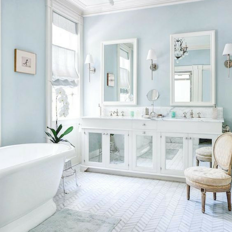
The colour blue is associated with features such as intelligence, safety and a sense of peace. As it is related to intellect, consider painting your bedroom or office blue to help you give that extra boost.
As soothing and serene pastel blue is, it’s a room colour that could give off quite cool and chilling vibes. Especially in a room that receives little natural light. If your home has too much blue, it may produce a cold and unfriendly mood for guests so that’s why it is best to combine walls painted in pastel blue with furniture in warmer hues.
Blue: clear thinking, tranquility, harmony, calm, meditative
Purple Rooms
Purple is historically the room colour of royalty and luxury. The effect of purple on your mood depends on what shade you choose. In its darkest values (eggplant, for example), is rich, dramatic and sophisticated. It is associated with luxury and creativity; as an accent or secondary colour, it gives a scheme depth.
Dark purple, similarly to black, can get a bit too overwhelming. This deep, saturated shade of purple is a sophisticated way to make a bold statement. It is best used as an accent to give a room a depth and in combination with its lighter shades.
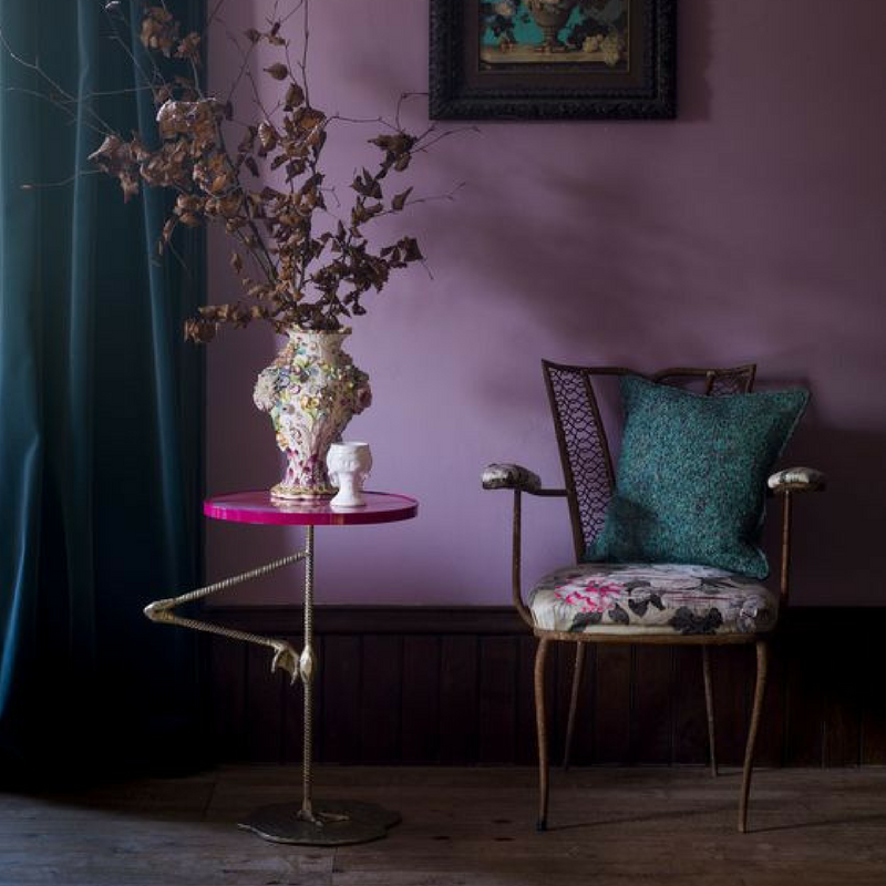
Deep purples give off a romantic, mysterious and luxurious vibe and are great for sparking creativity. While deep purples aren’t the best for the bedroom, where you want the mind to relax, lighter purples are better suited.
Shades such as lavender and lilac are better options as they are calming and light. By painting a room in the lighter shades of purple (lilac and lavender), you will be setting a peaceful and tranquil mood.
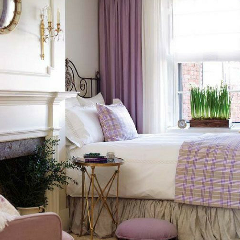
These shades bring the same restful quality to bedrooms as blue does, but without the risk of feeling cool. Lilac promotes feelings of mystery, creativity and spirituality and is favoured in bedrooms.
Purple is often the favourite room colour of adolescent girls, it stimulates the problem-solving areas in our brain, and it promotes creativity, intuition and artistic ability. In design, it communicates richness and sophistication.
Purple: stimulating, romantic; blue-violets are cooling, spiritual
Neutrals Rooms (black, grey, and white)
Neutrals (black, grey, and white) are basic and primary colours within any decorator’s tool kit and are most often employed as the main colour scheme. All-neutral schemes fall in and out of fashion, but their virtue lies in their flexibility: Add colour to liven things up; subtract it to calm things down.
Why we love them? Because they are flexible and can be easily combined with all the other colours.
We now shine the spotlight on neutral tones. If you’re trying to make a statement with colour, why go neutral? Because it is calm, steady and quiet, and it can tone down other vibrant shades.
Neutrals are the perfect backdrop to the colours you DO want to highlight. Black is the only neutral which could be quite overwhelming if used in big doses, which are why it is best used an accent. Using black as an accent can help ground your colour scheme and bring drama into your space.
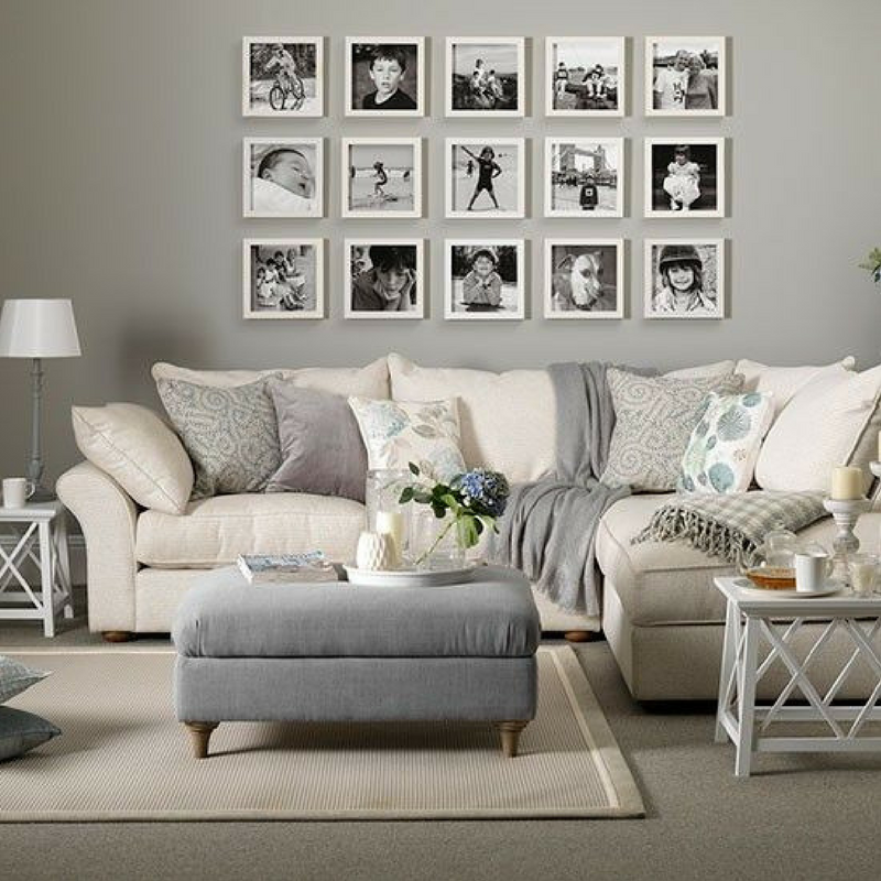
Not only are neutral colours timeless, but they also are extremely flexible. With their ability to match every colour, it’s great to include neutral colours into your colour scheme. White can help make a space feel airy and open.
During your next home project, black and grey may be your colours of choice. When used in moderation they communicate independence, confidence and authority. However, if used in excess, you will create a negative and confrontational environment, so be sure to use other colours to compensate.
Neutral: stability, hearth, home, endurance, simplicity and comfort
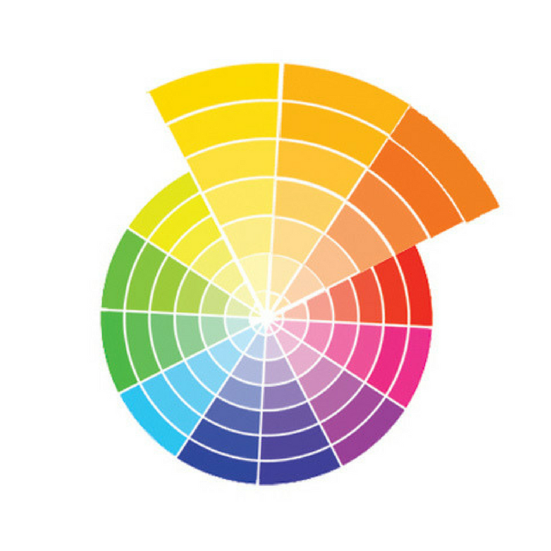
Mixing Colours Together
Mixing and matching colours in your interior may seem difficult and maybe even confusing. However, we’ve got some simple tips and advice on how to use alternate or complementary colours to help make your room pop.
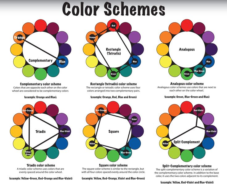
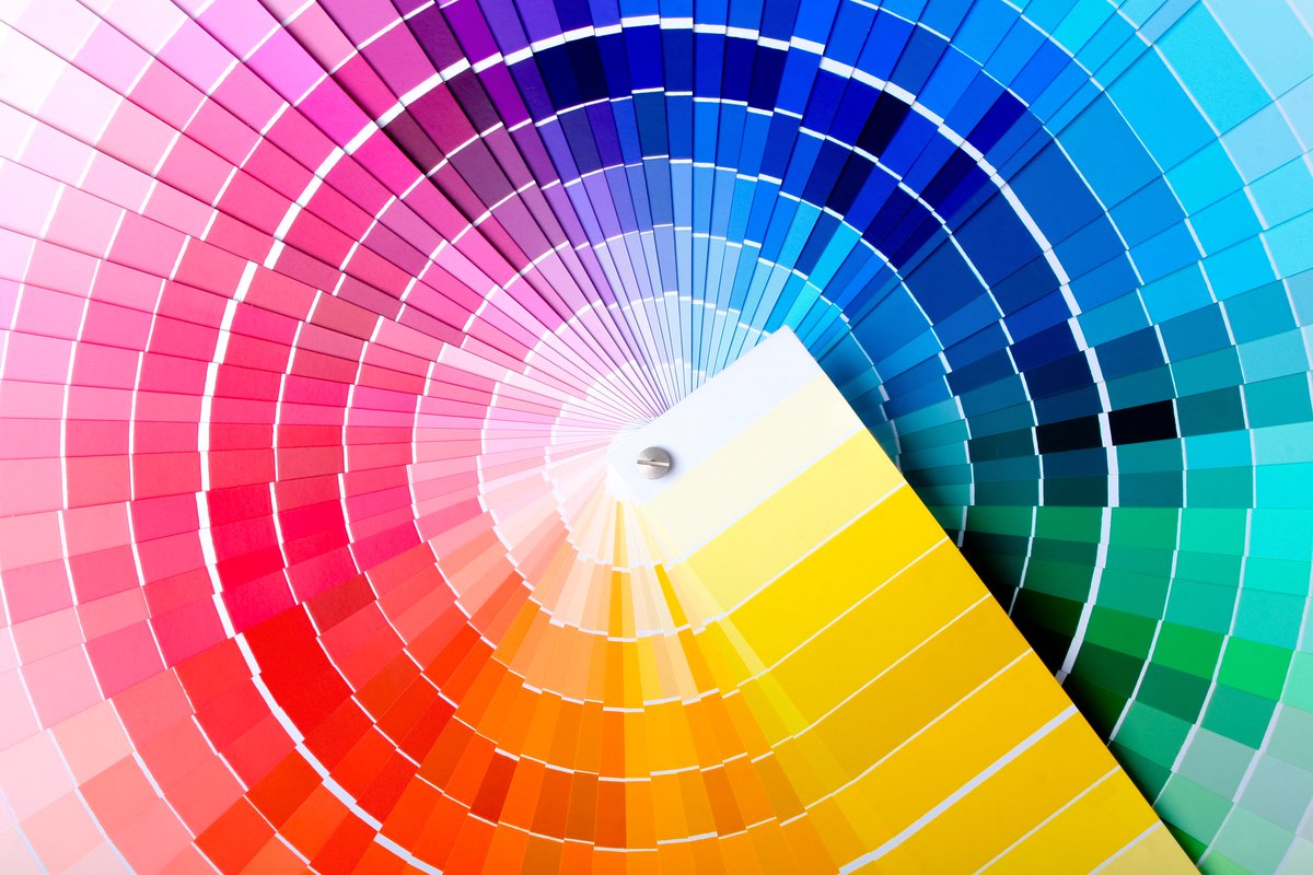
So let’s get started: The Colour Wheel and how it can be your best friend!
Analogue Colours
Analogous Colours – When you select a series of colours that sit next to one another on the colour wheel. This could mean looking either to the right or the left of that colour to find it’s analogous colour scheme. These colours work because they will bring harmony to an interior.
Yellow-orange, orange and red-orange shouldn’t work together, but do because they sit right next to each other on the wheel. However, as you can see from the image above, they are a simple, analogous colour scheme that makes a statement that exceeds the sum of its parts.
Complementary Colours
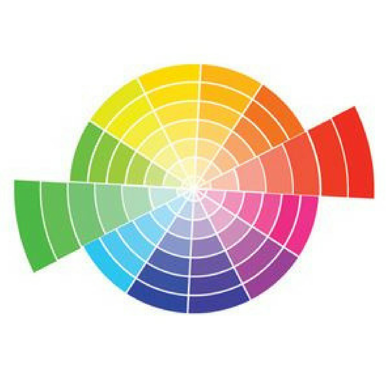
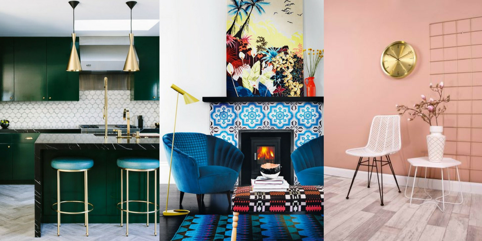
Complementary Colours – When you pick a colour from the Colour Wheel that you like then go to the exact opposite side of the wheel. They are complete polar opposites and though you might think they would clash – they actually set each other off very nicely!
Green and red look great teamed together and are key to creating stunning, dramatic rooms. Even black and white are opposites, which is why they always work! Look to the colour wheel when picking the perfect shade: Pair purple with yellow, blue with orange, and red with green.
Triad Colours
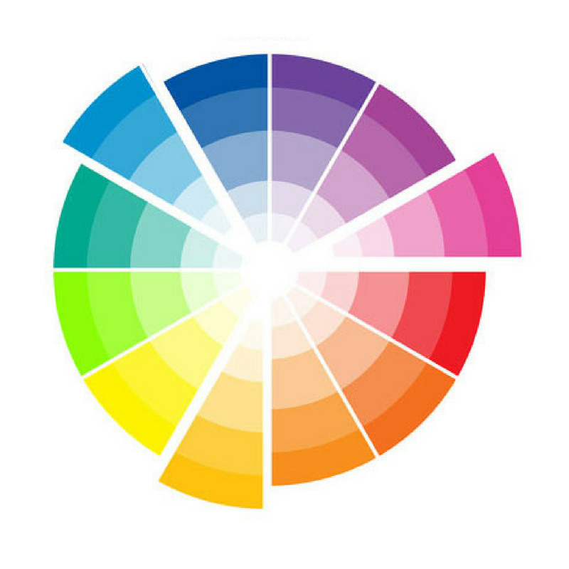
Triad Colours – Just like analogous, a triadic colour scheme is easier to understand than it may sound. Instead of grouping three or more colours that neighbour each on the colour wheel, you’ll be taking three colours that are equally spaced and decorating your space with these beautiful, contrasting shades.
The two most basic triadic palettes are the primary colours red, blue, and yellow and the secondary hues orange, purple, and green. For example, in the image above, the scheme has used yellow-orange, blue-green & red-violet and by choosing this combo, you’ll achieve a balanced look.
Monotone Colours
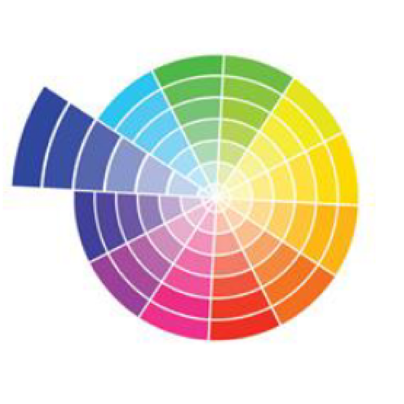
Monotone Colours – If you want to keep your look streamlined and chic, then choose one colour choice only, but team it up with other items of the same colour but that are different in tones, shades, saturation, and tints, of that same colour.
This is an easy solution when you’re decorating a room and perhaps you’re not feeling confident on what other colours to match with your home accessories! Using variations of the same colour can make a room look larger, so it’s great for decorating small spaces.
Selecting Ceiling Colours
The ceiling is often referred to as the fifth wall in a room, but too often it gets nothing more than a coat of white paint. In fact, for decades, white was considered not only the safest but also the best choice for ceilings.
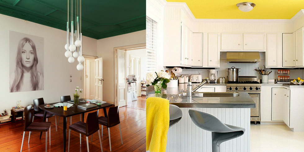
The colour on the ceiling can enhance a room’s character, but beware of excess: for primary living areas, keep the ceiling treatment simple so you don’t grow tired of it.
Similar Posts

Colour Trend For 2017: Denim Blue
Pantone Colour Trend of The Year 2017
Thoughts?
What colours are you drawn to? How have you brought colour intentionally into your home? Leave a comment down below, as we’d love to hear your thoughts!
Don’t forget to check out our Red, Green, Blue and Purple room colour Pinterest boards. For more information on how to paint a room, check out our helpful beginners guide here.
For extra information on Colour Theory, discover our infographic here.
Updated May 2021.
Leave A Comment