A feature wall can be a great way to rethink your home space and revamp your interior decor. Feature walls have been a key interior trend for the past few years, and there’s no sign of this stopping.
However, we are seeing the trend grow and transform. Where previously it was common to just see a simple paint colour, we’re now seeing textures, shapes and use of wallpaper.
We’ve got some of our top tips on what to remember when building a feature wall into your decor.
Complementary Colours
A feature wall is also called an accent wall. Which may give you a clue into how it can be used in your home.
We often talk about the use of accent colours and shades to help build up a theme for each room. To help give a cohesive feel to a space. Whether you’re redecorating the whole room and including a feature wall, or just wanting to spice it up a bit – remember to always consider the rest of the room.
A feature wall can be used as an accent or the main star of the show. Either way, ensure the rest of your furniture, accessories and walls sit well with the wallpaper. If you’re going for a printed design, pick out a key aspect and colour of that print and build it out into the rest of the room.
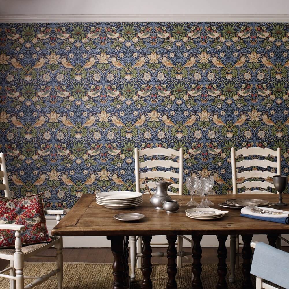
For example, we love this Morris & Co Strawberry Thief design for its bright colours and bold print.
Tonally, this is an incredible printed wallpaper to use to pick out key accents from. The wallpaper’s dominant colour is blue, but the bright red strawberry motif throughout is a contrast to be picked out. Opt for red accessories to make this aspect pop and create a striking room design.
Be Bold With Print
When it comes to using a feature wall, be bold with your choices. As it’s only on the one wall, you don’t have to fear certain prints or shades as they can be balanced by the other walls.
Busy patterned prints work well for a feature wall. It adds interest and draws the eye to the space as soon as someone enters the room.
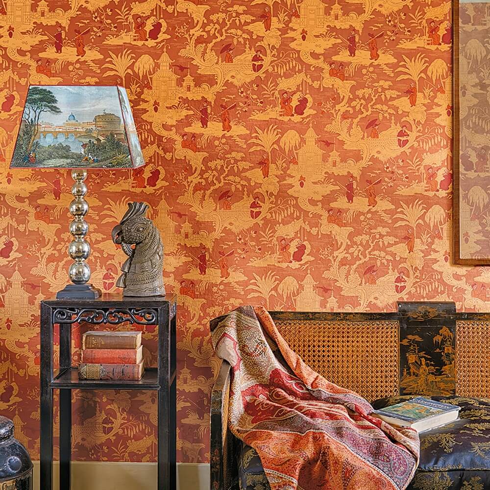
Be bold with both colour and print for a feature wall that has a breathtaking affect. Choose something like this Cole and Son Toile Wallpaper.
The orientalist style print is big and bold in a saffron orange shade. This will bring a decadent lift to any room you use it in.
If you’re worried about how to use printed wallpaper, check our blog post giving you the do’s and don’ts of how to use patterned wallpaper in your home.
Choose A Focal Point
A feature wall is a feature wall and it should do just that. When choosing which wall to decorate, you need to choose something that is a focal point within the room. Use the wallpaper that simply accentuates the natural point the eye is drawn to in the room.
Choosing a wall that is partially hidden or the attention naturally faces away from will not have the desired effect you want.
Use the shape and space of your existing interior to guide where the feature should be. Choosing a wall that isn’t the focal point will simply create two spaces battling to be the main centre of attention. Which will create an interior that will feel off.
Opt for a wall where a key piece of furniture sits, like the head of the bed or where the sofa sits against.
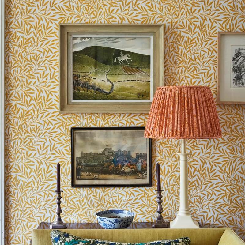
A style like this Willow design by Morris & Co is a soft wallpaper choice to use, with the mustard tones and movement from the design of the leaves.
Think About The Room
As with any form of interior design, when bringing in a new element – particularly a statement – you need to consider the room as a whole.
This again comes back to ensuring the space is cohesive. To marry well with the feature or accent you are bringing in.
If you have a room that has a lot of furniture in it – it might be that a feature wall will be too much. The addition of an added print or design to contrast with the opposing walls may mean the room will feel overcrowded.
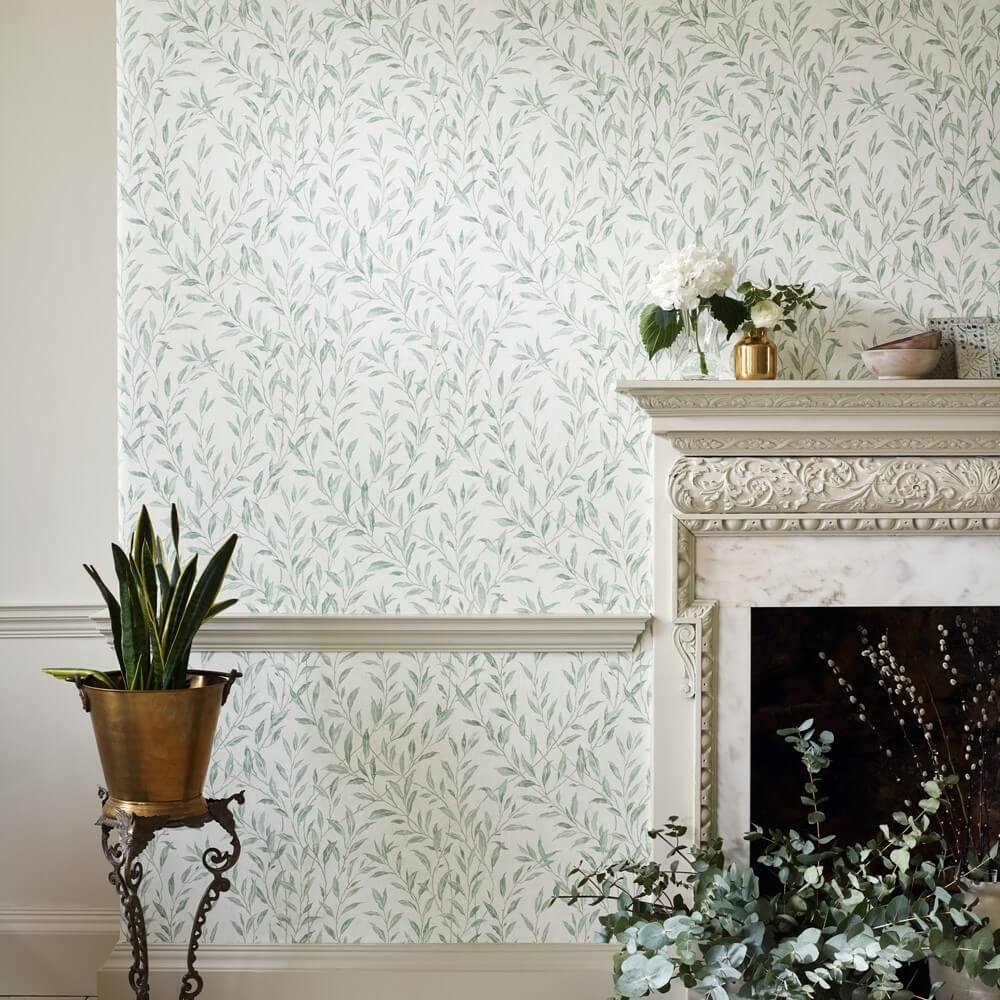
Use a softer and subtler print like this Osier Wallpaper by Sanderson in a grand yet soft approach.
Similarly, a small room can be made to feel smaller if you use print on just one wall. A small room will benefit from every wall being covered in the wallpaper. A feature wall is likely to shrink the room and make it lack balance.
Unexpected Styling
If you’re choosing to add in a feature wall, don’t shy away from going even bolder with it. A feature wall may be a statement, but it shouldn’t stop at that.
If you’re opting for a bold, statement print – why not mirror it in another room of your house. Or even use it on the inside of lampshades for a pop that will help to add that always important cohesion.
Equally, if you have an interesting shaped wall like an alcove or an arch, use this to your advantage. Create interest with this space and build on it to create a statement space in your room.
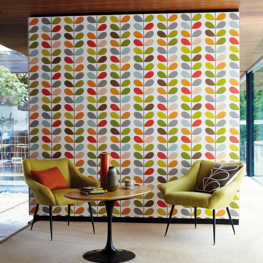
There’s nothing quite as unexpected as the designs of Orla Kiely, be bold and make a statement with her Multi Stem Wallpaper design.
Thoughts?
Will you be incorporating a wallpapered feature wall in your home? Do you have a favourite wallpaper style you can’t wait to put up? Let us know in the comments!

Leave A Comment